Overview
A widget represents a specific element in the user interface (e.g. checkbox, button or login screen, etc). To customize a widget, click on the Widgets tile in the Simplifier dashboard and choose the Widgets tab.
Within the overview, you can edit, take a look at the details, delete or copy a widget or take a look at the description, category, tags, and set it to deprecated or not.
Add a new Widget
Press the ‘+’ button on the right to add a new Widget. Enter a Widget name and select the System Library, the Widget should use. Press ‘Ok‘ to create the Widget.
General data to your Widget
Use the tab General to set the metadata of your Widget, making it easier to use it in your Applications’ UI Designer
| Property | Description |
|---|---|
| Category | Select the Widget Category you want to assign the Widget to |
| Description | Add a description to be shown in the UI Designer. You can use HTML-tags to format your description |
| Documentation URL | If you have a additional documentation URL you want to provide your App Builders, add the URL here. It will be shown in the ‘Others’ section on setting the Widget’s properties in the Application. |
| Tags | Tag your Widgets to find them faster |
| Projects | Assign projects if required |
| App Wizard | Use the assignment, if you have AppWizards that guide the user to configure your Widget in the Application Editor, or if the AppWizard replaces your Widget |
| Deprecated | Deprecated widgets are no longer displayed in the UI Designer. Deprecated Widgets that were used before they were marked as deprecated are still displayed within the Application’s content. Your Application will continue to be saved and deployed without issues or warnings and runs as before. |
| Icon | Add an icon that represents your Widget best |
Widget Template
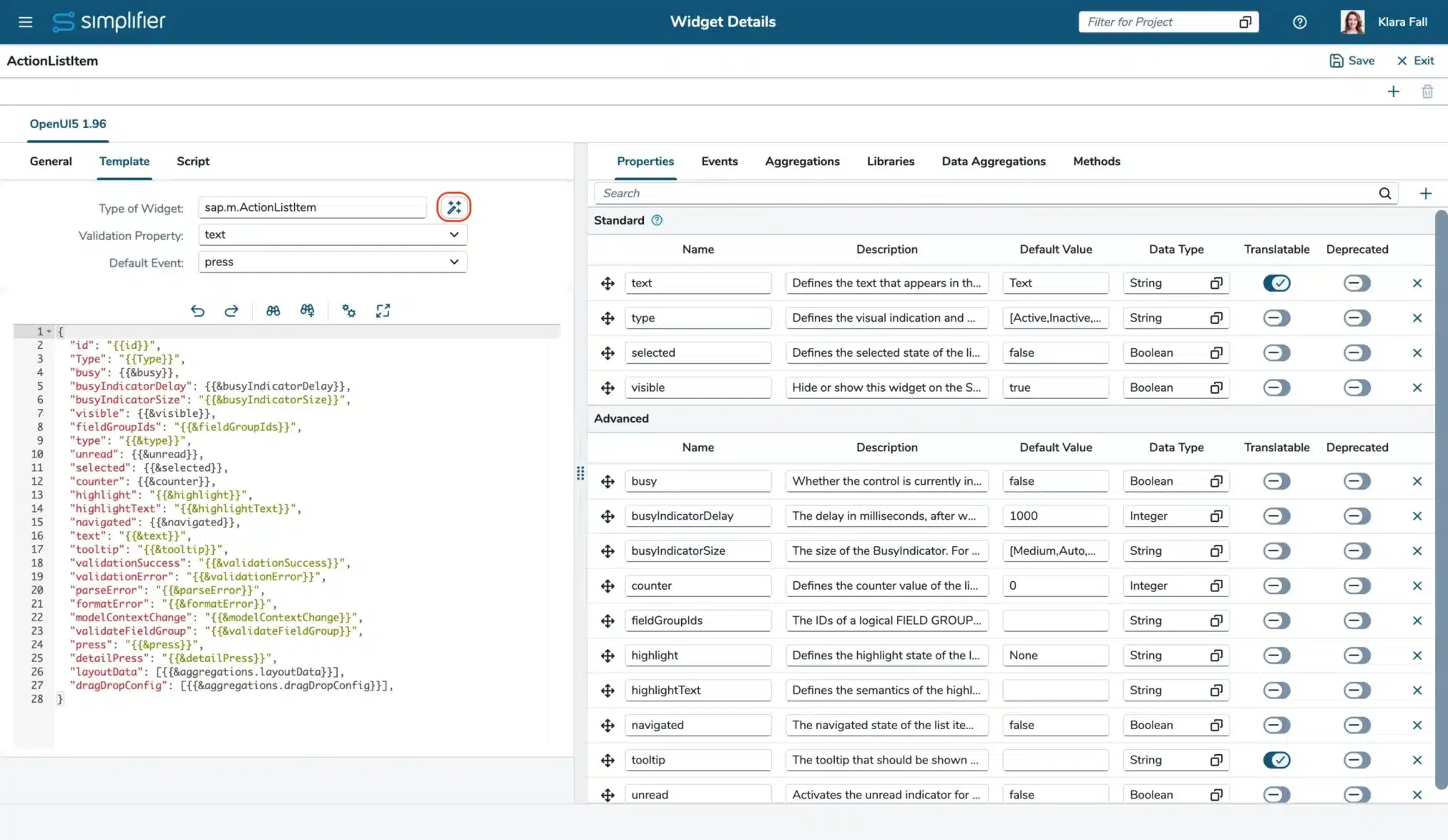
Define the Widget’s template as JSON to define all properties, events, and aggregations. Besides the Template, you need to configure them in the right area as well.
If your Widget extents a control existing in the assigned System Library, use the Wizard to create the template and the detailed configuration.
Enter the Widget’s path to the ‘Type of Widget’ input field and press the Wizard-button
Widget Script
To add your extensions you need to add your logic as script. You can extend existing controls if required.
Edit a Widget
If you want to enhance a Widget with new properties, events, or aggregations, you need to
- Add them in the Template
- Add the default definitions in the Script
- Add the configuration in the right area


