Basics
Most commonly used elements
Button
A simple Button with Text and/or Icon.
ButtonSegmented
A Button that contains several sub-buttons, allowing the user to pick one out of many options.
CheckBox
Simple Checkbox with a Label.
DatePicker
A DatePicker, including a popup calender to select a date.
Dropdown
A dropdown field that allows selection of one option out of multiple options.
Icon
A simple Icon that can display all the icons that are available on OpenUI5’s Icon Explorer.
Image
Displays an Image from the Image Explorer/Assets section of your application or from external sources.
Link
A Hyperlink control used to navigate to other apps or web pages or to trigger actions.
Message
An element to display a Message, embedded on the application screen. The message container can be set to specific states (Information, Success, Warning and Error) and can be closed via button.
RadioButton
The RadioButton is a control similar to a checkbox, but it allows you to choose only one of the predefined set of options.
Switch
A Switch is a control that represents a binary state, like on/off or true/false.
Text
The Text control can be used for embedding longer text paragraphs, that need text wrapping, into your app
TextArea
The text area is used to enter multiple lines of text. When empty, it can hold a placeholder similar to an input. You can define the height and width of the text area and also determine specific behavior when handling long texts.
Title
A simple, large-sized text with explicit header/title semantics.
Cards
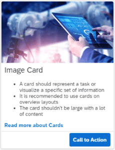
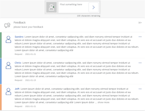
A card represents an app or page. It can be used to launch the app or navigate to the page content. Integration cards are a way of making application content available to end users in a consistent manner.
CardWithImage
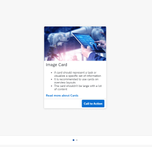
A Card that displays an image on the upper area, and a text and a footer on the lower area.
ProductCard
A Card that is displaying the details of a product. The Card includes a header with a title and subtitle, a detail section with an image and text, and a footer with an action button.
Tile
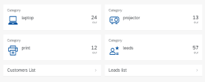
Container Element that displays header, subheader, and a customizable main area in a tile format.
Charts
Different types of charts. Charts contain and display large sets of values in an interactively rich and responsive way.
BarChart
A Bar Chart to present your data in a visual form. The data is represented as vertical bars.
Based on the JavaScript library ChartJS (version 3.9.1).
DoughnutChart
A Doughnut Chart to present your data in a visual form. The chart is divided into segments, the arc of each segment shows the proportional value of each piece of data. In a Doughnut Chart, the segments of data look like the pieces of a doughnut.
Based on the JavaScript library ChartJS (version 3.9.1).
LineChart
A Line Chart to present your data in a visual form. The data is plotted as data points on a line.
Based on the JavaScript library ChartJS (version 3.9.1).
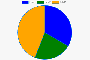
PieChart
A Pie Chart to present your data in a visual form. The chart is divided into segments, the arc of each segment shows the proportional value of each piece of data. In a Pie Chart, the segments of data look like the pieces of a pie.
Based on the JavaScript library ChartJS (version 3.9.1).
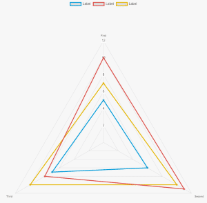
RadarChart
A Radar Chart to present your data in a visual form. The data is plotted as data points on lines around a center point.
Based on the JavaScript library ChartJS (version 3.9.1).
Dialogs
DateTimePicker
A Date and Time Picker, including a popup calendar to select a date and a time.
PopupMessage
A simple Dialog with a title, a text message and an OK-button.
PopupToast
A small, non-disruptive popup for messages that disappears automatically after a few seconds
FormAddress
A Simple Form to display an address.
FormContact
A Simple Form to display contact data (e.g, mail, phone, mobile).
SimpleForm
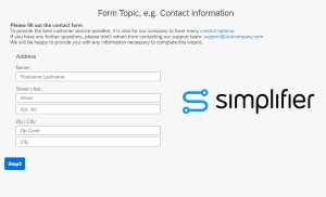
The Simple Form provides an easy-to-use way to create basic forms. A Label inside the form indicates a new row, and all other controls following the Label will be placed inside the same row.
Layouts
Layouts are used to build and structure application pages.
AppHeader
A Header Bar for your application screen that includes a title, an avatar and a logout button.
BlockLayout
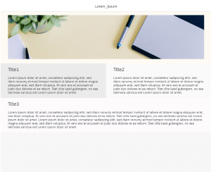
A layout consisting of responsive blocks of different sizes. You can place images, texts, etc. inside the blocks.
DynamicPage
The Dynamic Page is a base structure for your application that comes with empty content containers (page header, page content) and built-in responsive behavior.
GridLayout
A Base Layout for arranging content in a grid-like structure. Use this widget group to create flexible, responsive application layouts.
HorizontalLayout
A Base Layout to display elements in a row (horizontally).
Panel
A Container with scroll functionality that can be used for text and other controls (e.g., buttons). The Panel does not layout the embedded controls.
SideMenu
A Layout that is divided into three parts: the Toolbar, the Side Menu and the Main Content.
Based on OpenUI5’s ‘tnt.ToolPage’ with ‘tnt.SideNavigation’.
ThreeColumnLayout
A Layout that is divided into three columns, which are seperated with a small margin.
ToolbarHeader
A Header Bar with a left, middle and right area where content can be placed.
TwoColumnLayout
A Layout that is divided into two columns, which are seperated with a small margin.
VerticalLayout
A Base Layout to display elements vertically in a column.
Lists
Includes Tables, Lists and more. Usually contains homogeneous data displayed in rows.
List
A Simple List to display multiple data entries.
ScanAndSearchBar
An element for searching values, with an additional option to scan a barcode (on mobile devices only).
SearchField
An input field to search for a specific value.
Table
Table for displaying multiple records, with filter and sorting functions – optimized for responsive designs on mobile devices.
Maps
Maps are used to visualize data in an easy and intuitive way. A map is a symbolic visual illustration of areas, regions, and themes.
Map
A mobile-friendly and interactive map based on the JavaScript library Leaflet.
Media
Carousel
An element to present images and other content like a slideshow.
ImageLightBox
Displays an Image that is clickable. The displayed image will be opened in a dialog when clicked.
Wizard
Wizard
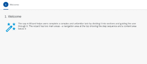
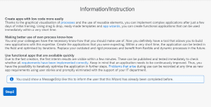
Enables users to accomplish a single goal which consists of multiple sub-tasks. Guides the user through these sub-tasks step-by-step.