Add Widgets to the Screen
To fill your screen with UI elements like text fields, charts or action buttons, use the widget or the widget group panel on the left side. First, select the OpenUI5 version.
Via the filter, only the compatible widgets matching the stored UI5 version of the application are displayed.
Search for a specific widget or widget group using the name or just browse the list, then add the it to the screen via the plus icon or drag and drop it into the tree or the preview. The widget or widget group will appear in the content area of the selected screen.
Sort Widgets in the right order
Use the arrow keys to structure the widgets in the screen content tree into a hierarchy. Alternatively use WASD on your keyboard or drag and drop the widgets or widget groups.
You can also use the arrow keys to structure the widgets in the screen content tree into a hierarchy, or alternatively use WASD on your keyboard (the widget needs to be selected).
| W or |
moves the widget upwards |
| A or |
de-nests the widget |
| S or |
moves the widget downwards |
| D or |
nests the widget underneath the one above (if possible) |
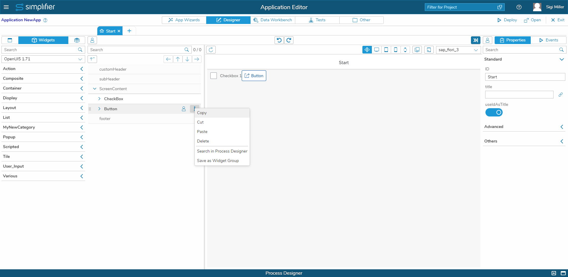
With the arrow keys on your keyboard, you can navigate through the screen content tree as follows:
| Up ↑ | Navigates up |
| Down ↓ | Navigates down |
| Right → | Opens the currently selected tree item (if possible) |
| Left ← | Closes the currently selected tree item (if possible) |
Copy Widgets within the Screen Content
| You can copy Widgets and insert them on a different Screen or even another Application. For that, use the Copy, Cut and Paste function. |
Edit Widget Properties
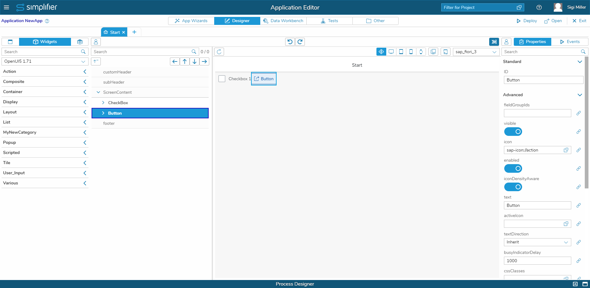
Every widget has properties to configure how the widget behaves. In the following example the properties of a button widget are shown.
| Every widget has properties to configure how the widget behaves.
On the left are an example of the properties of a button widget.
|
Icon Explorer
| Use the icon explorer to add icons to widgets that have an image or icon as property. | |
| You can also add a font to an application that contains icons to use in the icon explorer. Images uploaded under Assets can also be selected. |
Client Validation of Default Properties
The data type of default properties in application items can now be overwritten, but only domain types with the same basic type can be used.
| You can find the settings in the Properties panel of the UI Designer. The button opens a popover, which lets you define the data type and the validation event. If the validation is enabled (checkbox), an indicator will be displayed. You can change the valueState and valueStateText as result.
In this example, we wanted to make sure, that the input field will be filled with the correct data, an Email Address. Therefore we added the validation for the predefined Datatype “Email” on the change Event. |


