Do you also know the issue that your UI elements look lost on large screens or your UI is streched to be hardly to use?
It is common sense on developing web-applications to fit the UI to its content. This means that you should only use the full width of the screen, if you have enough content to be displayed.
Always keep in mind to help the user to be able to focus on your content and have easy to use interfaces.
Letterboxing can help you with that. I fixes the layout to a maximum width. If the screen size is bigger than the maximum width, a whitespace is added on the left and right side of your content. On smaller screen sizes, your content width will behave repsonsive and get smaller as well.
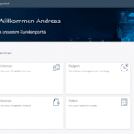
When should I use letterboxing?
- You want your content like forms appear simple and focused
- Your content does not require the full screen width like in applications that mainly provide forms
When should I NOT use letterboxing?
- You need to display a lot of information like in applications with tables that have many columns
STEP 1: Add library ‘SimplifierLetterbox’ to your application
Edit your application and add the library ‘SimplifierLetterbox by clicking the ‘Other’-menu on top and selecting ‘Libraries’.
For details on how to add a library to your application see our documentation.
STEP 2: Upload background image
If you want to use a background image to be displayed in the whitespaces on the left and the right side, upload an image to your application.
For details on how to upload an image to your application see our documentation.
STEP 3: Deploy application
Deploy and letterboxing is active
Conclusion
Letterboxing is a great way to help the user focussing on your app and to create simple to use UI.
Just add or remove our SimplifierLetterbox library to/from your app do activate and deactive letterboxing for your application.
The library ‘SimplifierLetterbox’ is available in Standard Content since Content Update 5 for Simplifier Release 8.