In this article, I’m going to show you how to visualize data in your application using the Simplifier Charts Widget.
Prerequisites
For this tutorial, you should already know how to create Applications, set Widget properties in the UI Designer, map data from Business Objects to Widgets in the Process Designer, create Business Objects and create Data Types. If this does not sound familiar to you at all: learn how to create an Application and read about the basic concepts (UI Designer, Process Designer, Business Objects, Data Types).
The Charts Widget – Data Structure
The Charts Widget basically consists of Labels and Datasets.
Labels are the description of the displayed data, whereas Datasets contain the DataPoints that are displayed.
This is easier to understand in an example:
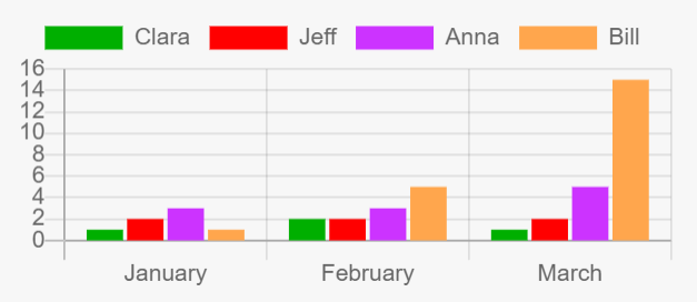
The bar chart above shows, let’s say, how many chocolate bars were eaten by four persons (Clara, Jeff, Anna, Bill) per month (January, February, March).
The Labels here are ‘January’, ‘February’ and ‘March’ on the x-axis.
The Datasets are the persons, ‘Clara’, ‘Jeff’, ‘Anna’ and ‘Bill’, indicated by their respective colour.
The DataPoints of a DataSet are the concrete values that are displayed in the chart, e.g. for the Dataset ‘Bill’, the DataPoints are 1 (in January), 5 (in February) and 15 (in March).
Chart Widgets in Simplifier
In the UI Designer, you can use three options to add a Chart Widget to your Application:
- Use the basic Chart Widget
- Use a Chart Widget Group
- Use the ChartDashboard template
1. Use the basic Chart Widget
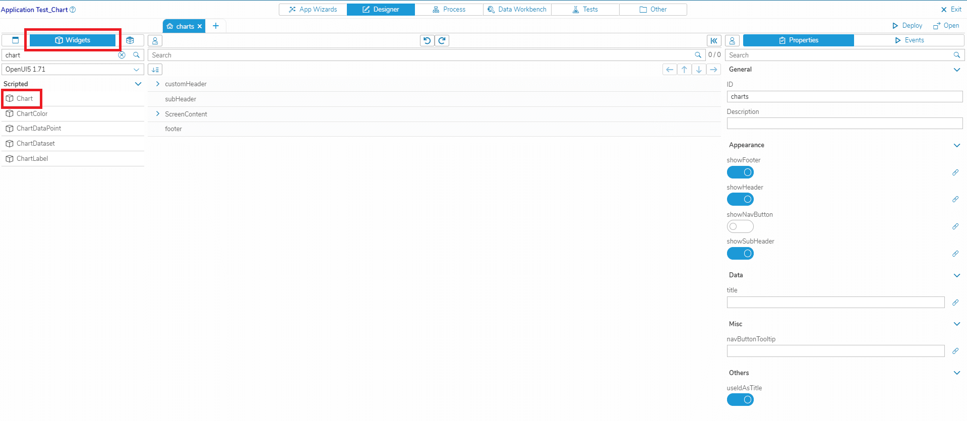
To use the basic Chart Widget, go to the UI Designer, select the widgets tab and search for ‘chart’. We will use this basic Chart Widget in the Use Cases 1 and 2 described in this article to display static and dynamic data in our application.
2. Use a Chart Widget Group
Instead of using a basic Chart Widget and add the labels/datasets manually, you can also use a Chart Widget Group where the labels and datasets are already pre-filled. In the UI Designer, select the widget group tab and search for ‘chart’. You can find widget groups for several chart types. Select the type that you want and adapt the pre-filled data to your use case.
3. Use the ChartDashboard template
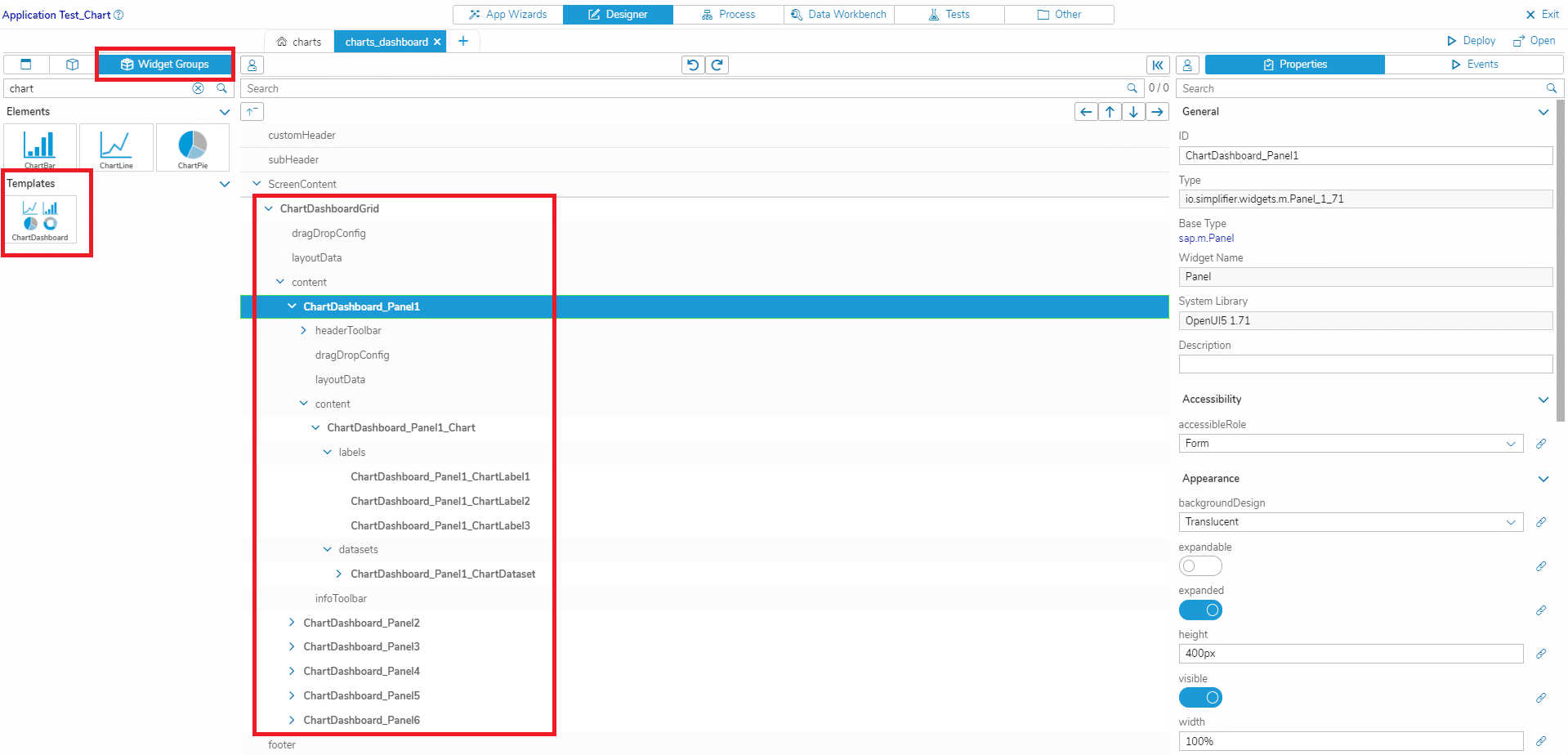
If you want to display multiple charts on one screen, consider using the ChartDashboard template. This UI template contains a grid layout with several panels, each panel containing a Chart Widget with pre-filled data. In the UI Designer, select the widget group tab and search for ‘chart’. Add the template ‘ChartDashboard’ to your screen and adapt the pre-filled charts and their data to your use case.
Use Case 1 – The Charts Widget in the UI Designer with static data
In this step, we will build the bar chart above with static data entirely in the UI Designer.
Add the Chart widget
- Create an Application or open an existing Application
- Select the screen where you want to display your chart
- Add a Grid Layout to the screen (ui_layout_Grid)
- Add the Chart widget to the Grid Layout (Chart)
- In the Chart widget, set the property ‘chartType’ to ‘bar’
Add the Labels
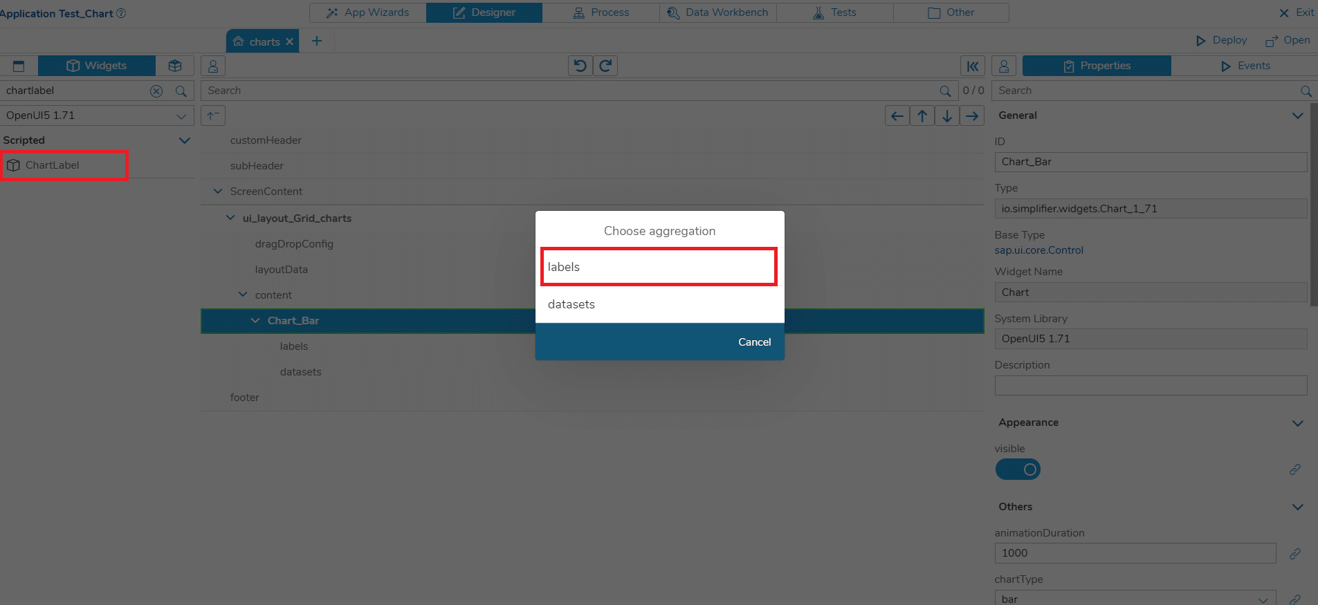
- Add a ChartLabel widget to the Chart. Choose ‘labels’ as an aggregation in the dialog
- Change the property ‘label’ of the Label to ‘January’
- Add two more ChartLabels with the text ‘February’ and ‘March’
Add the Datasets
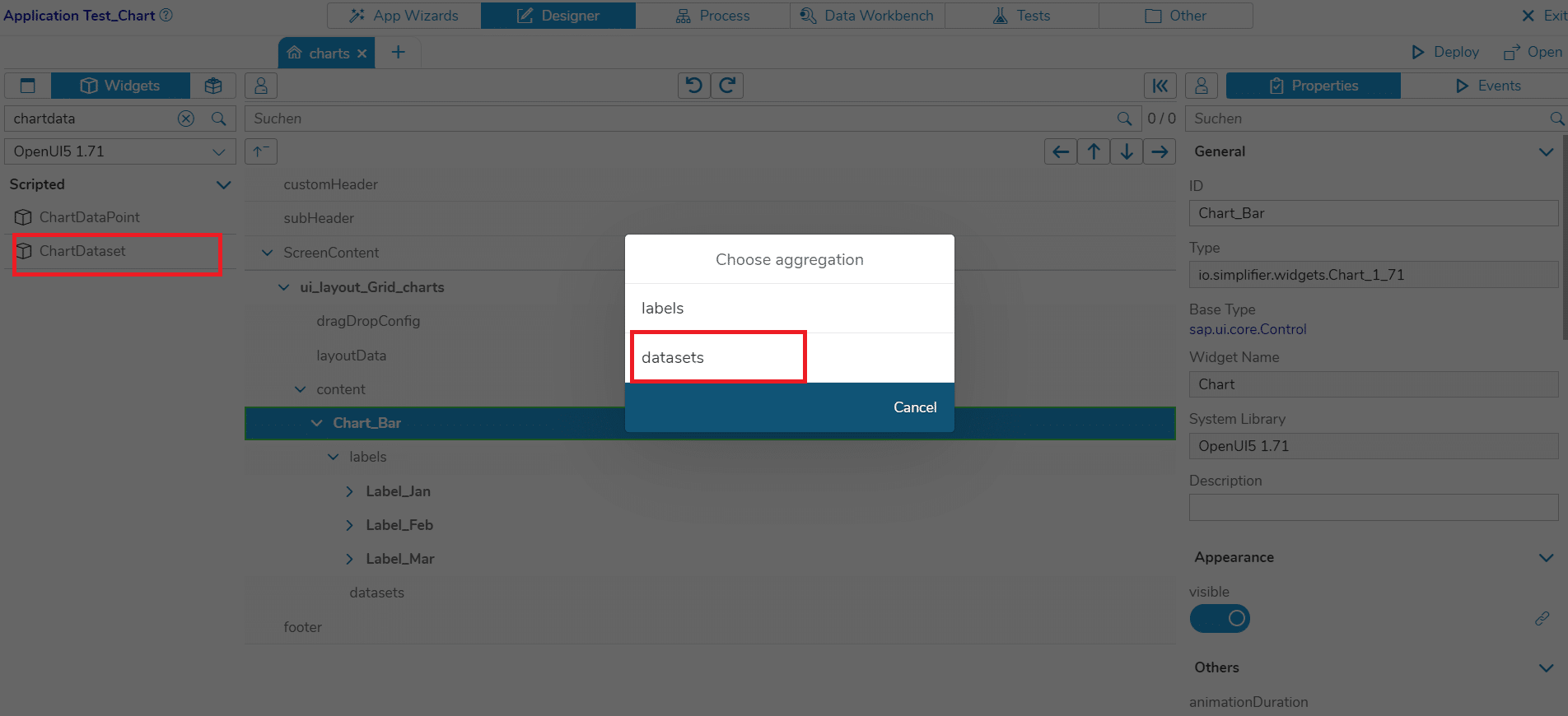
- Add a ChartDataset to the Chart. Choose ‘datasets’ as an aggregation in the dialog
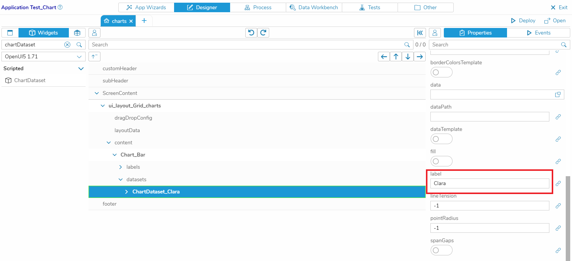
- Change the property ‘label’ to ‘Clara’
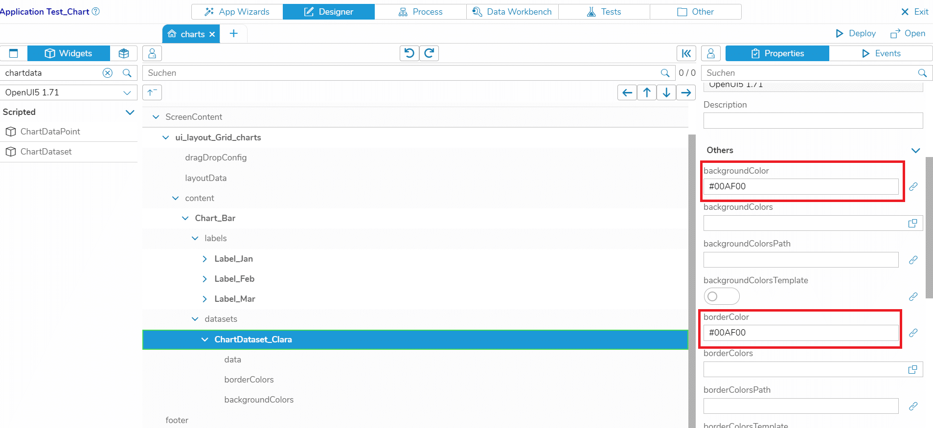
- With the properties ‘backgroundColor’ and ‘borderColor’, you can change the Dataset’s appearance
- Add three more Datasets to the Chart, each with a different color, and set the labels to ‘Jeff’, ‘Anna’ and ‘Bill’
Add the DataPoints
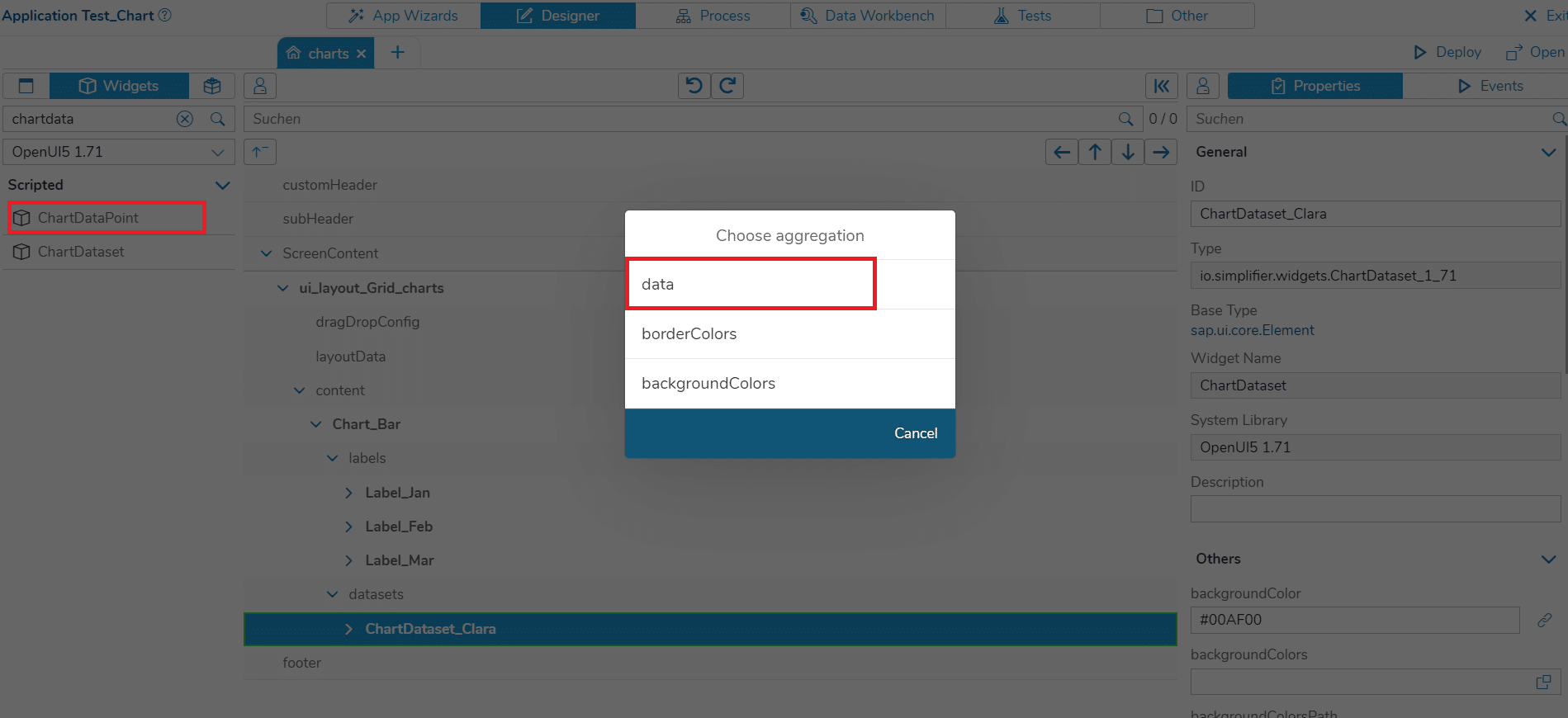
- Add a DataPoint to the Dataset for ‘Clara’. Choose ‘data’ as an aggregation in the dialog
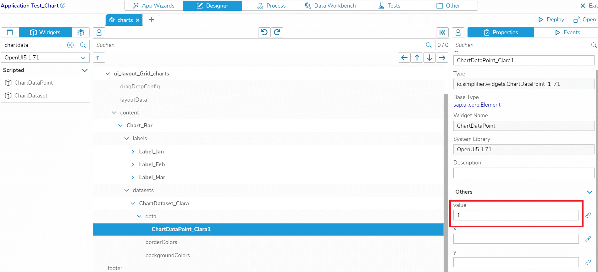
- Change the property ‘value’ to 1
- Add two more DataPoints to the Dataset for ‘Clara’, each with a different value. Also add three DataPoints to the Datasets for ‘Jeff’, ‘Anna’ and ‘Bill’ and change the values.
Deploy the App
Now, click on ‘Deploy’, open your Application and navigate to the screen with the bar chart. That’s it! In the next step, you will learn how to create a chart with dynamic data.
Use Case 2 – Working with dynamic data
In most use cases, you want to have a chart that displays data that is loaded from the backend. For this, we need to use templates in our Chart Widget and bind our data to the chart.
Create a Business Object for the backend data
The Script
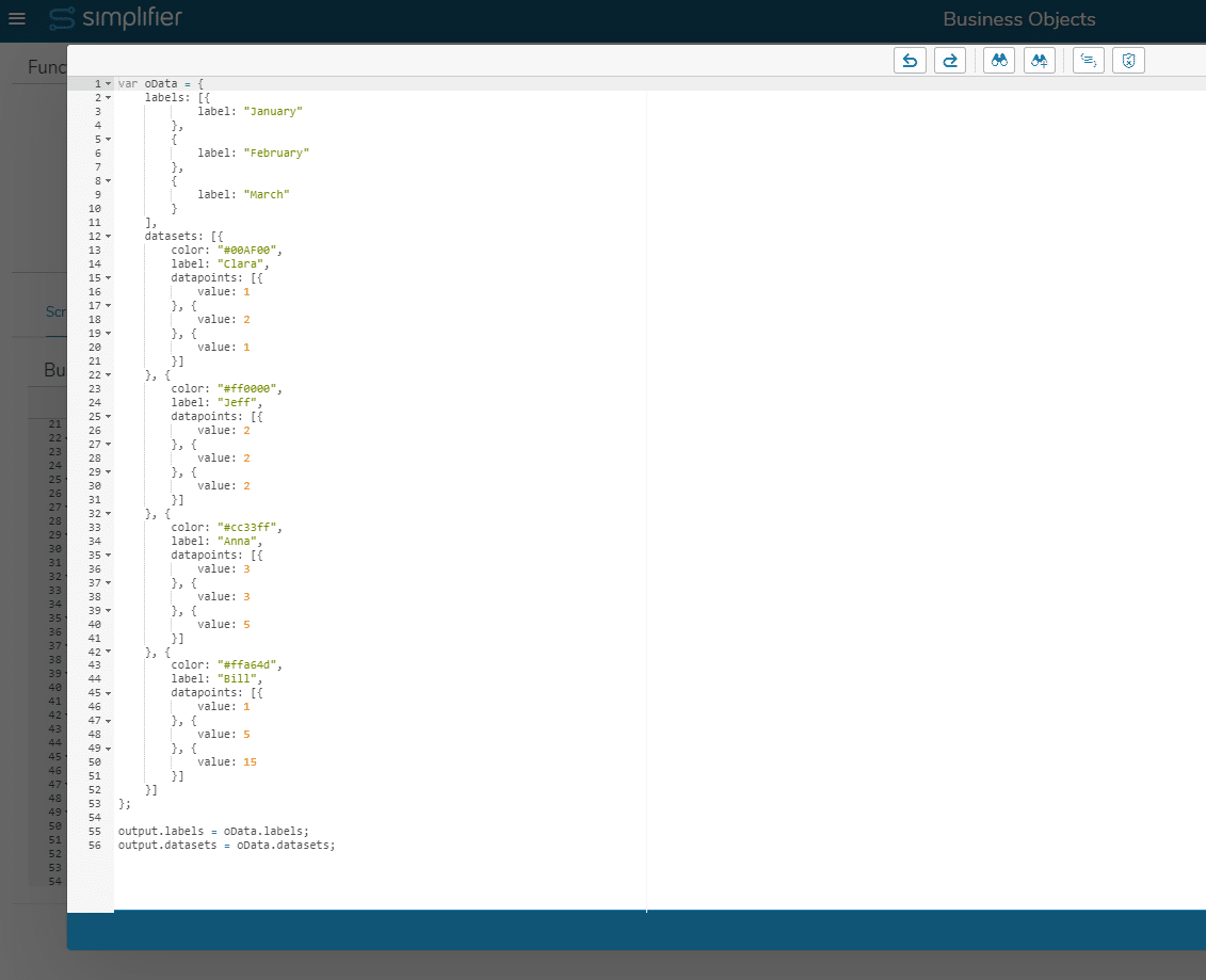
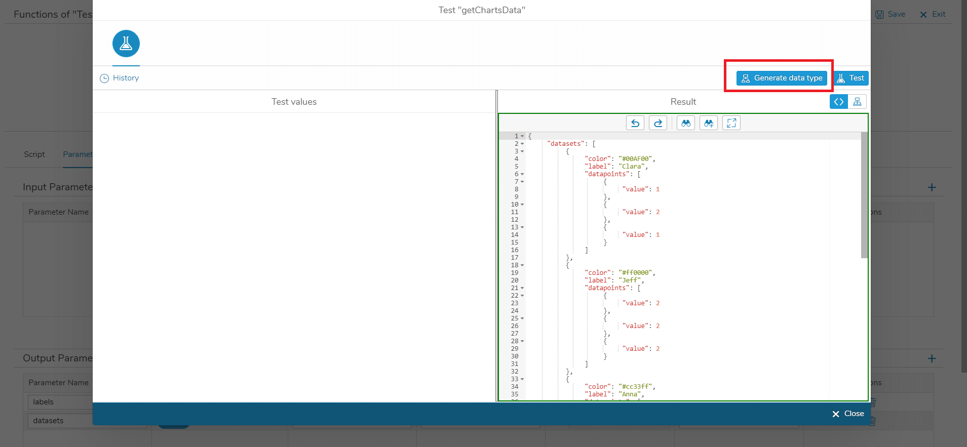
For this example, I created a server-side Business Object function ‘getChartsData’ that returns the data that we want to display in the chart. It is similar to the chart data that we saw above. Notice how the data is structured into Labels and Datasets, and the Datasets contain arrays of DataPoints.
The Output Parameters
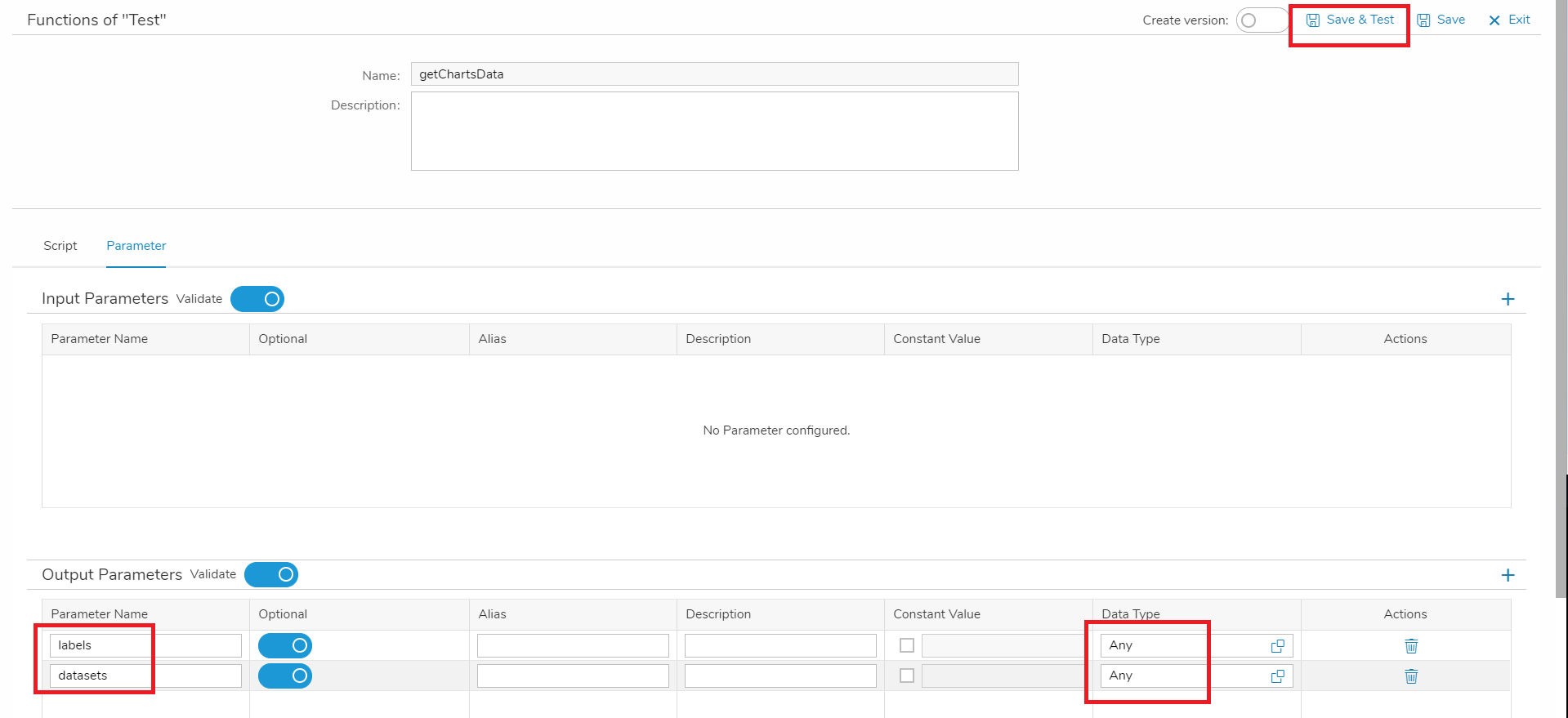
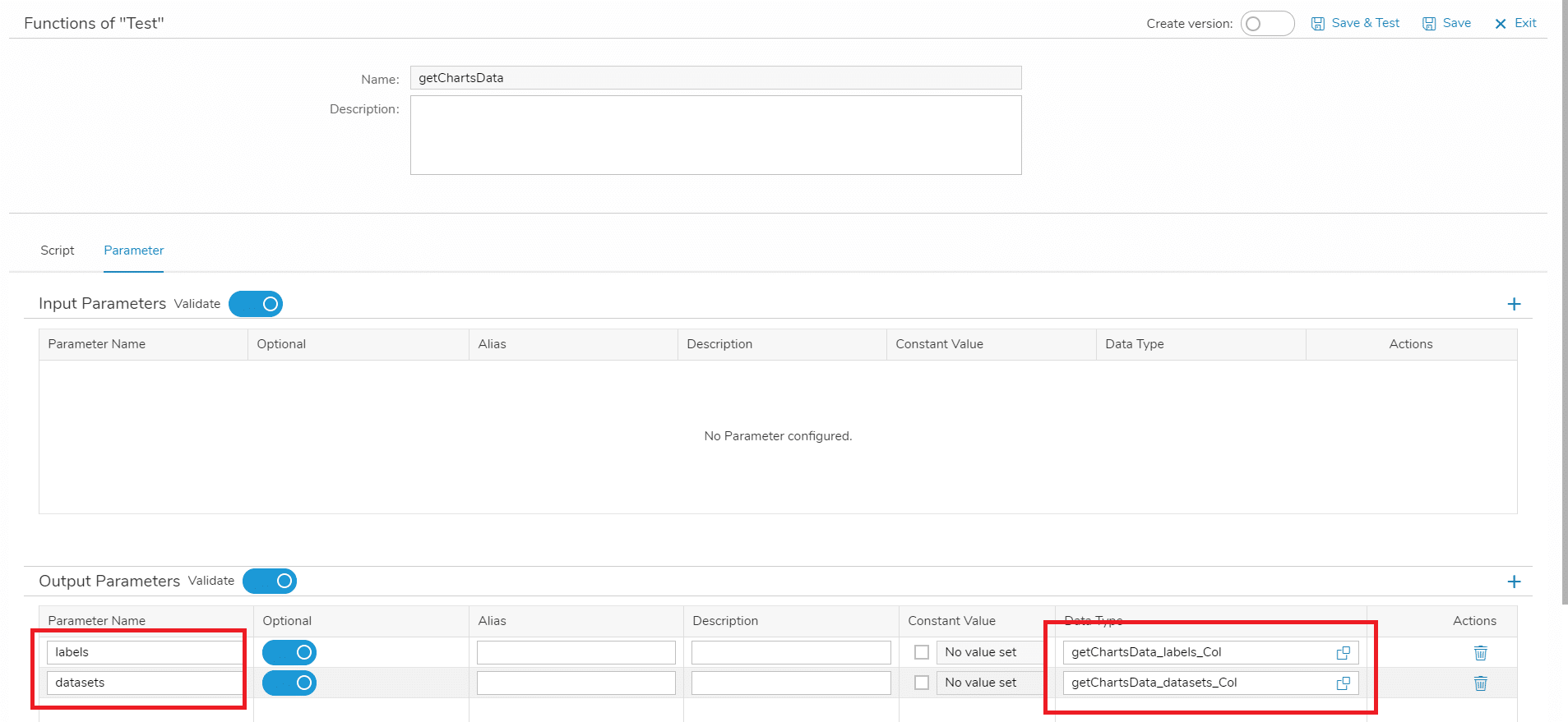
Your Business Object function needs two output parameters: ‘labels’ and ‘datasets’. For both, set the Data Type to ‘Any’.
Now, we want to generate specific data types for these parameters so that we can map them in the Process Designer. To do so, click on ‘Save & Test’. In the dialog, click on ‘Test’ first, then on ‘Generate data type’. By doing so, Simplifier automatically creates data types for the JSON data that you see in the results window.
Close the test dialog and set the data type of your output parameters to the newly created data types (in my case: ‘getChartsData_labels_Col’ for the labels and ‘getChartsData_datasets_Col’ for the datasets).
Create a templated Chart Widget in the UI Designer
For dynamic data binding, we have to create a Chart Widget that makes use of templates instead of static data. We can bind the Label data directly in the Process Designer. However, since the Dataset structure is nested (a Dataset contains one or more DataPoints), we cannot map them in the Process Designer. So, we have to store the datasets in a Global Variable and use the paths to this variable in the UI Designer to generate a mapping. Here’s what you have to do:
Add the Chart widget
- Create an Application or open an existing Application
- Select the screen where you want to display your chart
- Add a Grid Layout to the screen (ui_layout_Grid)
- Add the Chart widget to the Grid Layout (Chart)
- In the Chart widget, set the property ‘chartType’ to ‘bar’
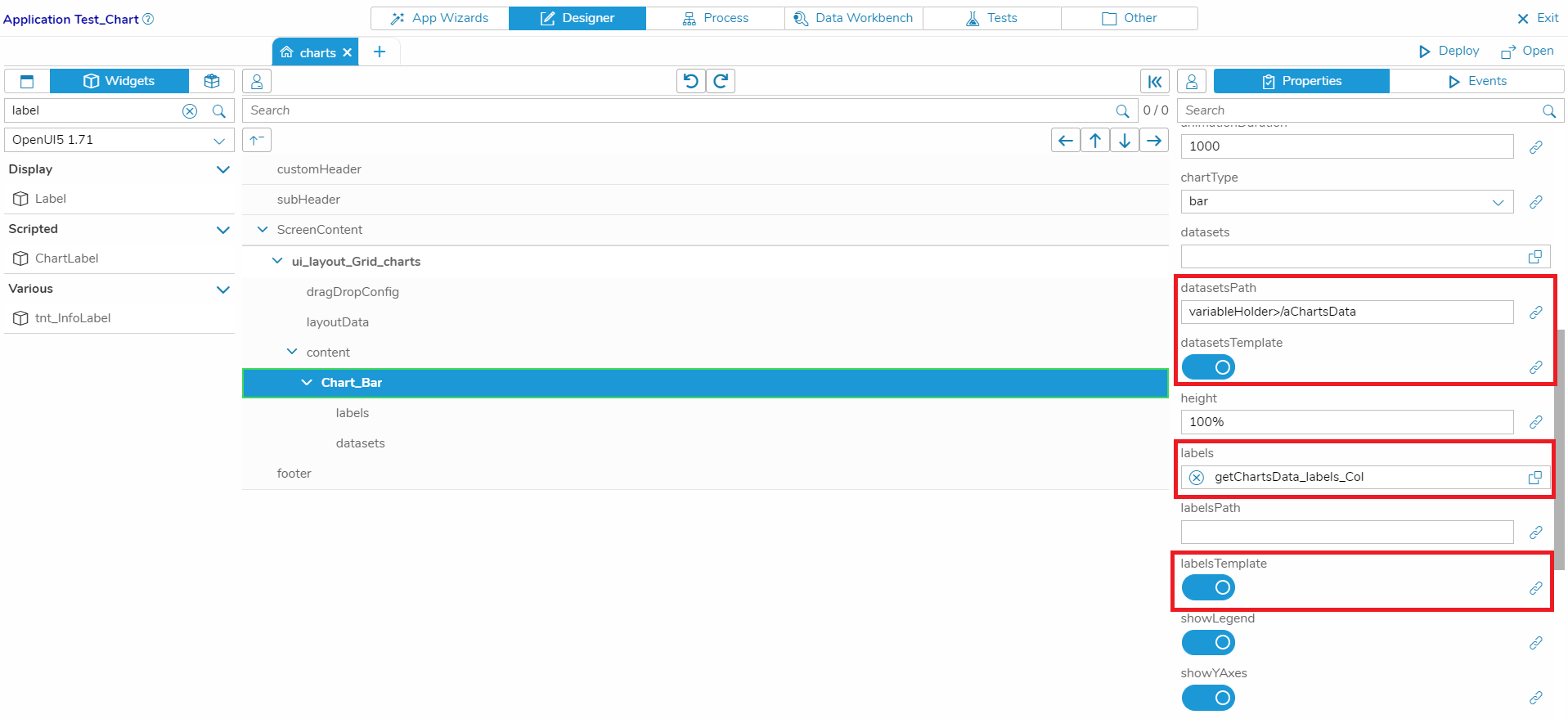
- Set the switches for the properties ‘labelsTemplate’ and ‘datasetsTemplate’ to ‘true’
- Set the property ‘datasetsPath’ to the Global Variable where we will store the datasets retrieved from our Business Object (in my case, the Global Variable is called ‘aChartsData’ – we will create the Global Variable later)
- Set the data type for the property ‘labels’ to ‘getChartsData_labels_Col’ (we have created this data type in the previous step)
Add a template for Labels and Datasets
- Add a ChartLabel to the Chart widget
- Add a ChartDataset to the Chart widget
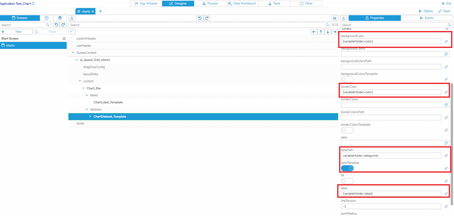
- In the ChartDataset, set the switch of the property ‘dataTemplate’ to ‘True’
- In the ChartDataset, set the properties ‘backgroundColorsPath’, ‘borderColorsPath’, ‘dataPath’ and ‘label’ to the respective paths of the Global Variable
Add a template for the DataPoints
- Add a ChartDataPoint to the Dataset
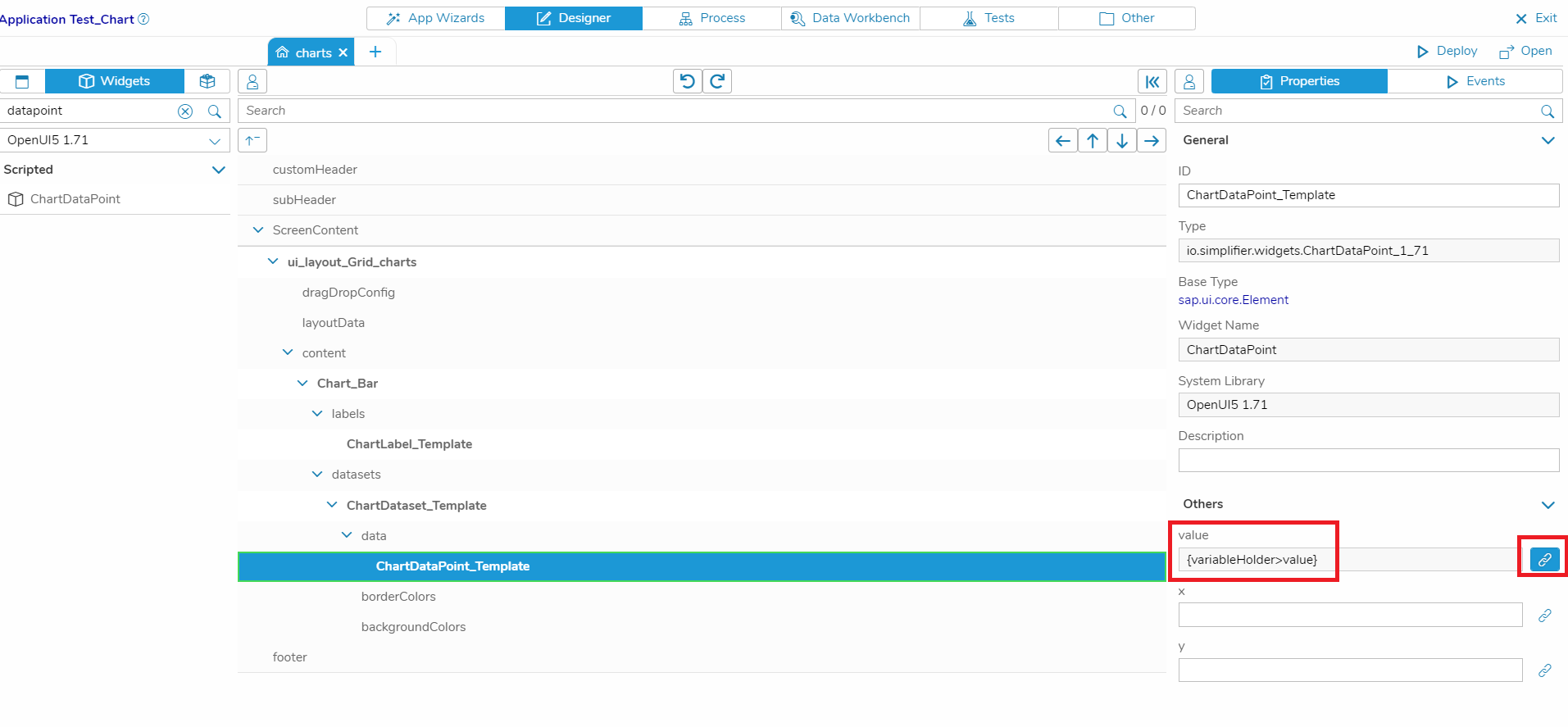
- In the DataPoint, set the property ‘value’ to the respective path of the Global Variable: Note that the property ‘value’ is of type Float, so just entering the path into the input field would result in an error since the String is not correctly parsed as a Float. To enter other data types than Strings correctly, click on the button on the right next to the input field. A dialog is opened where you can enter the path (as a proper model binding).
Map the Business Object data in the Process Designer
Almost done! We now have to create a Global Variable to store the data and then switch to the Process Designer to implement the data mapping.
Create a Global Variable
- Go to the Data Workbench
- Create a Global Variable called ‘aChartsData’ to store the datasets in
- Set the data type to ‘getChartsData_datasets_Col’
- Click on ‘Save’
Map the Labels
- Switch to the Process Designer and create a new story
- Subscribe to an event that is fired before your chart is displayed. In my case, I used the event ‘onAfterRendering’ of my start screen ‘chart’
- Add a Business Object shape, choose your Business Object and the respective function where the chart data is loaded. In my case: Business Object ‘Test’, function ‘getChartsData’
- Open the Output Mapping dialog
- Add a ‘Parameter’ shape
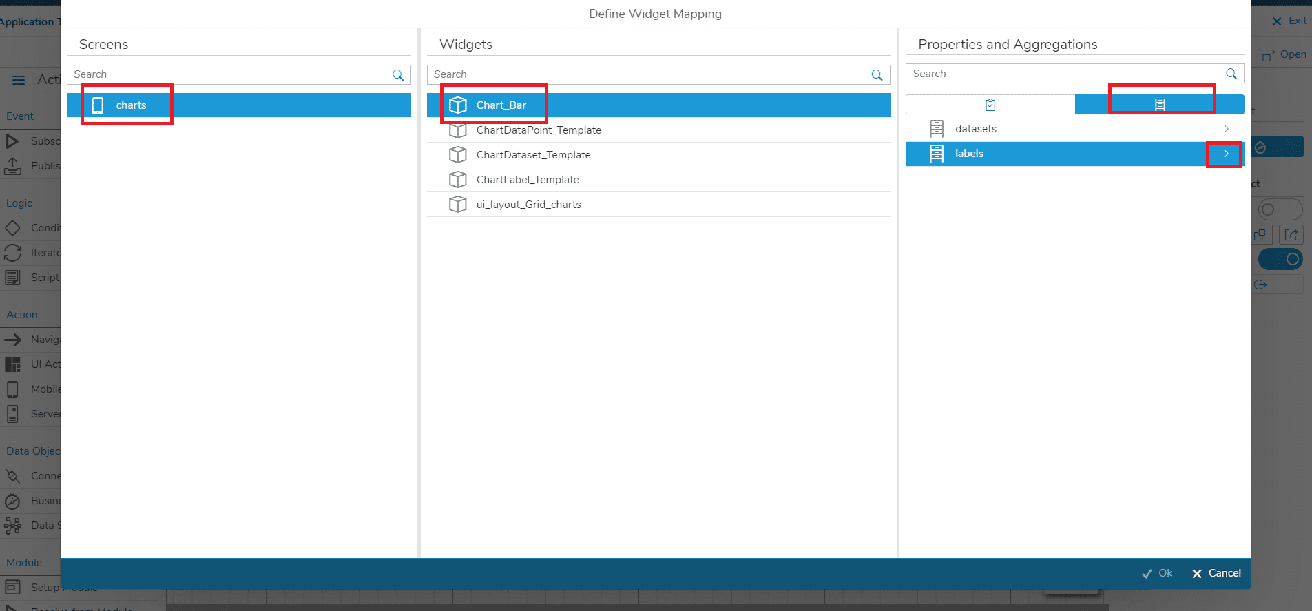
- In the dialog, select ‘labels’, click on the arrow icon, then click on the plus icon next to ‘label’
- Click on ‘Ok’
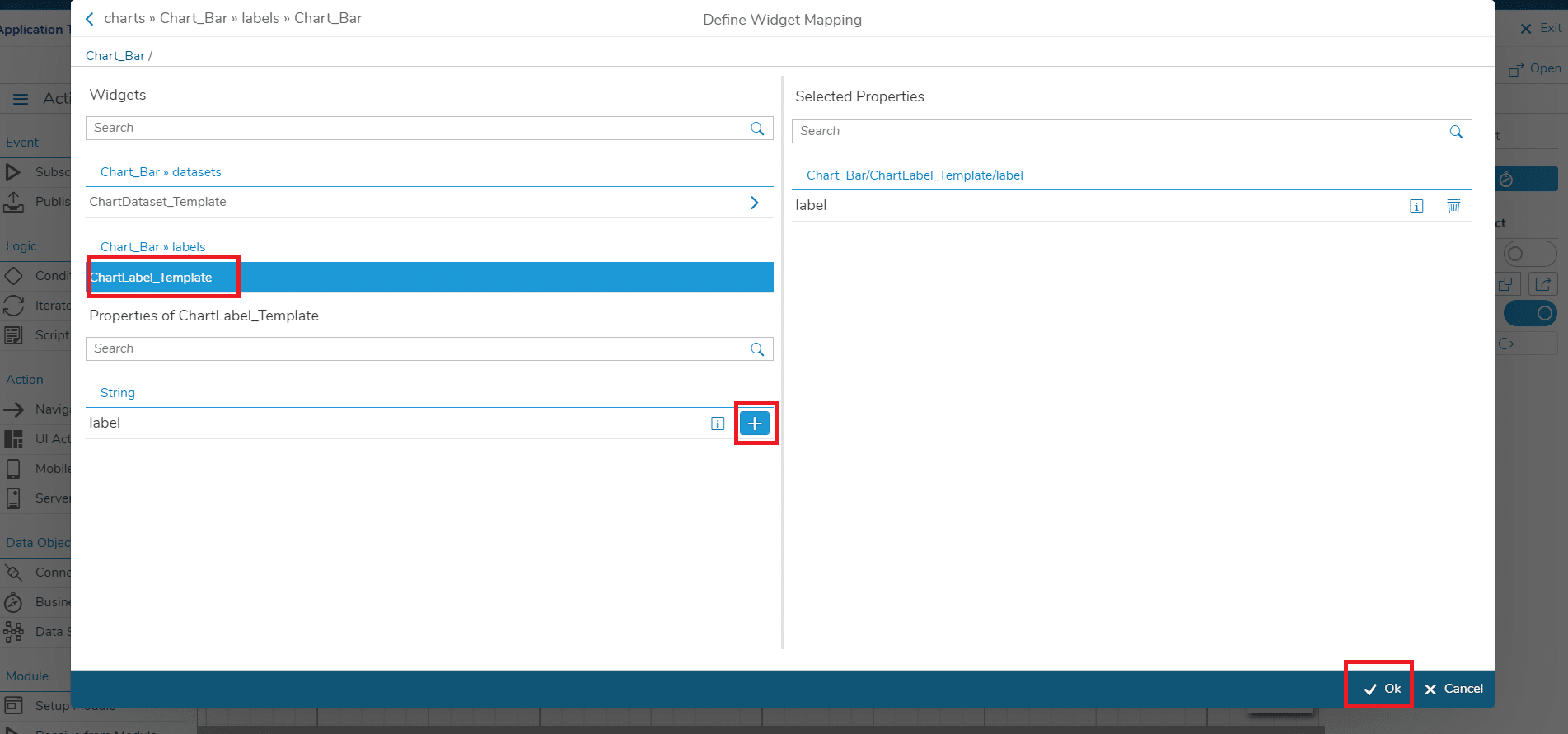
- Click on your ChartLabel template (in my case: ChartLabel_Template)
- Click on the plus button next to ‘label’
- Click on ‘Ok’
- Finally, connect the two shapes
- Click on ‘Ok’
- Now you have mapped the Labels of the chart!
Map the Datasets
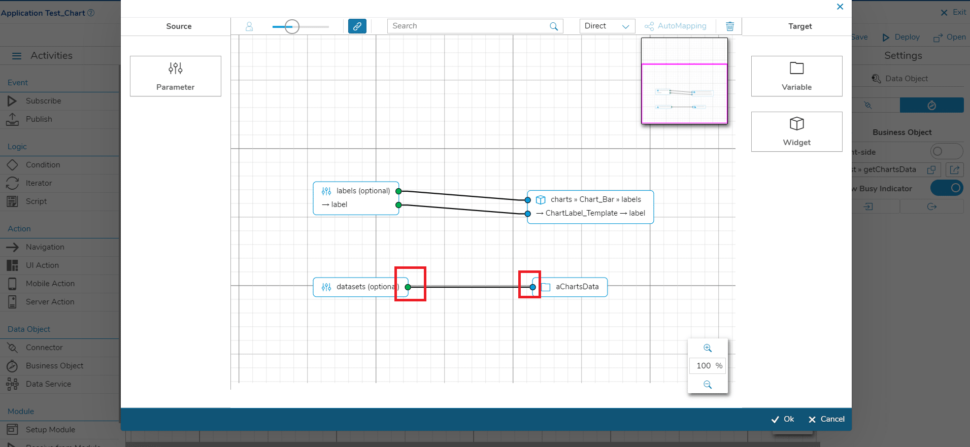
- Add a ‘Parameter’ shape
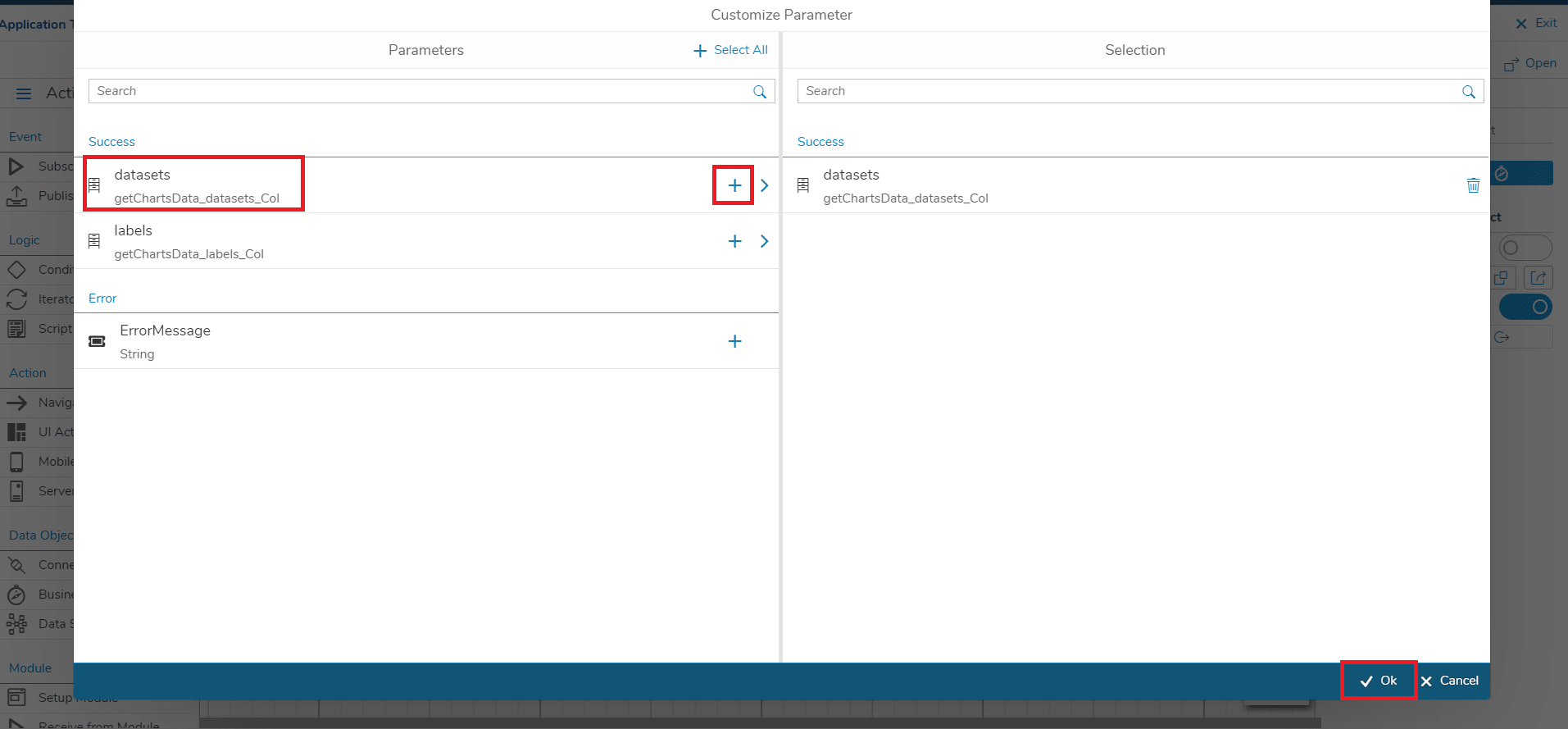
- In the dialog, select ‘datasets’ and click on the plus icon
- Click on ‘Ok’
- Add a ‘Variable’ shape
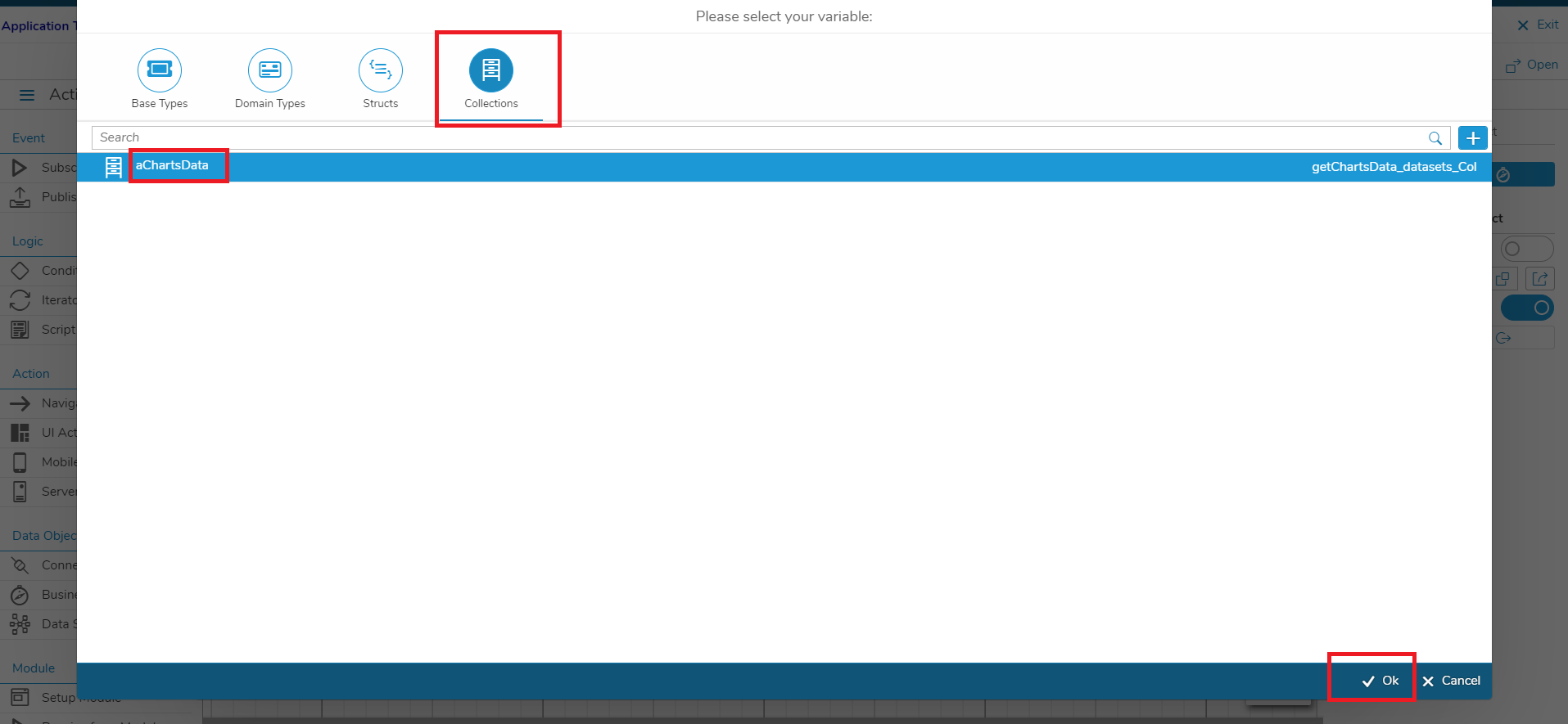
- Select the ‘Collections’ tab
- Select your Global Variable for the datasets (in my case: aChartsData)
- Click on ‘Ok’
- Connect the two shapes
- Click on ‘Ok’
- Now you have mapped the Datasets of the chart! Since we have specified the paths for the properties that we want to map in the UI Designer, we only have to map the output data to the Global Variable in this case
Deploy the App
Finally, click on ‘Deploy’, open your Application and navigate to the screen with the bar chart. You should see the chart with the data loaded from the Business Object.
That’s it, you’re done! You can now adapt the type of your chart (see next chapter), add/remove data in your Business Object, modify the colors, add more charts to your screen etc.
The Chart Types
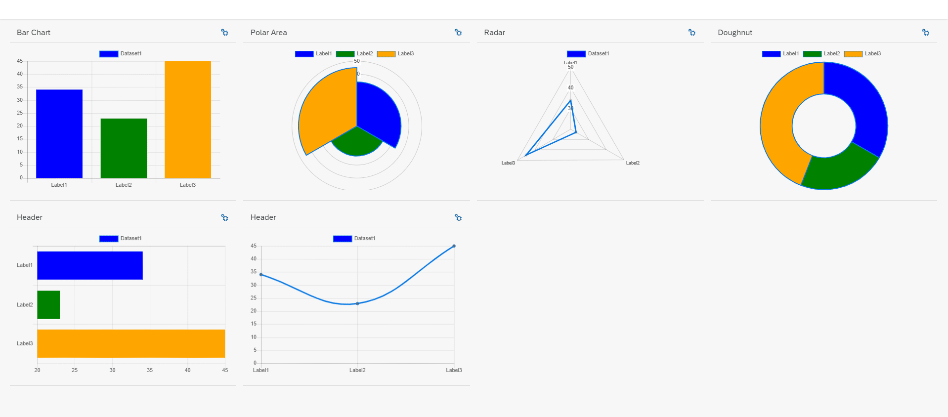
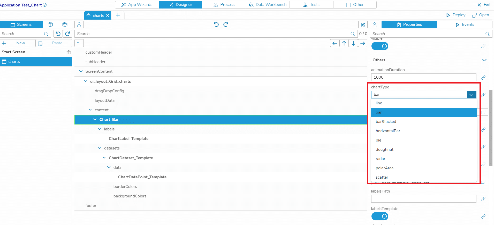
The Chart that we have created in the use cases above is a bar chart. There are several types of charts that you can select for the Charts Widget:
- line
- bar
- barStacked
- horizontalBar
- pie
- doughnut
- radar
- polarArea
- scatter
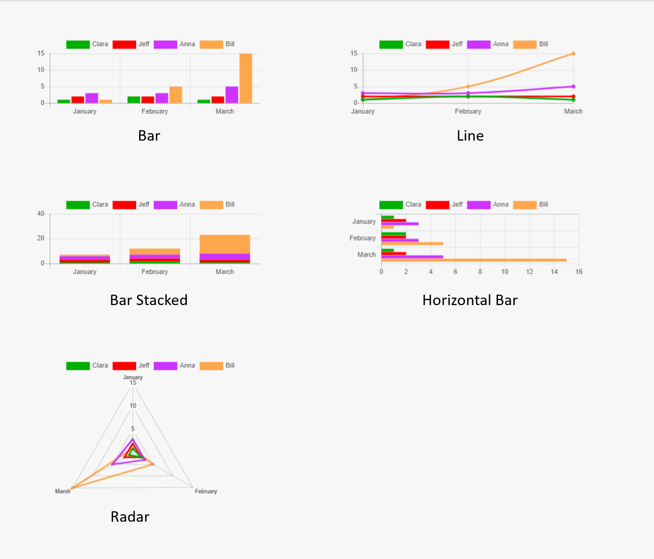
In the image below, you can see examples for some of the types. Just select the type that is appropriate for the data in your use case.
Note that the data structure can vary from type to type. You can find an overview on the different types and their data structures here: https://www.chartjs.org/docs/latest/charts/

