Integrate REST Connector Intermediate 200 Module 3 Lesson 2
-
1 year, 11 months ago #44842
What I see in the video and what happens on my end when using Simplifier is different.

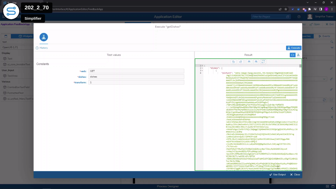
Above is the video example.
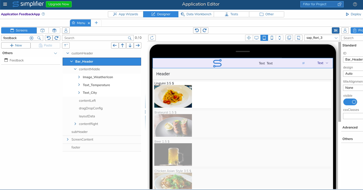
Below is what happens in Simplifier when I follow the directions.

Also, when the 3 buttons are added in the video they are small.
But when I copy the instructions the buttons are fairly large.
I am also having trouble placing the text on the right of the images. My text is above the images. Like the word Linguini etc.
I don’t know if I am making mistakes, or if the video is outdated.
Also, my bar header looks very strange. I may have accidentally added things I should not have. I don’t see what I have represented on my screen in the video.

 Armin WinklerModerator
 Has successfully completed the online course Introduction
 Has successfully completed the online course Intermediate (200)
 Has successfully completed the online course Advanced (300)
 Has successfully completed the online course Basics (100)1 year, 11 months ago #44961::
Hi A,
unfortunately your first two screenshots aren’t exactly helpful in determining what is different in regards of the output data you are receiving compared to what is shown in our course video. The picture field seems to be exisiting in both outputs but on the screenshot taken from the course video it is the upmost field to be included in the output object. As the value is a large data url string, no further included fields are visible from the output object. What exactly are you missing on your system? Please try to check your output parameter configuration and whether the data type that is assigned to the ‘dishes’ parameter has the expected format.
In regards to the second point that you raise, again the screenshot does not contain the information that you mention in your posting, i.e. there are no buttons visible in the UI tree. Which 3 buttons are you refering to and where should they be added? The buttons showing up as larger as in the course video is most likely caused by a different property configuration, so please compare your button configuration accurately with the one presented in the video.
You also mention that the alignment of the dish name in relation to the image is vertical instead of horizontal. If we assume that you are using a FlexBox widget to layout the alignment of the two nested widgets (Text and Image), you probably have not set the direction property of the FlexBox to the value ‘Row’ yet as this determines whether the alignment is based on x- or y-direction. In your scenario, I would assume that the direction property is set to value ‘Column’ instead.
Should you have the feeling that the preview does not represent the current state of your UI tree configuration, you can refresh the preview at any given time. To do so, just click once on the refresh button on the top left of the preview window. Additionally, there’s the possibility to undo any inadvertent changes made to the UI configuration by clicking on the respective button with the arrow icon pointing to the left on it which is positioned just above the preview.
Please let me know if this helps you.
Kind regards,
Armin
You must be logged in to reply to this topic.